# How Semi-precious stones bring colour and creativity to jewellery design
The world of jewellery design has experienced a remarkable transformation in recent decades, with semi-precious gemstones emerging as the vibrant heart of contemporary creations. These natural treasures offer designers an extraordinary palette of colours, textures, and optical effects that transcend the traditional dominance of diamonds and precious stones. From the deep celestial blue of lapis lazuli to the warm amber glow of carnelian, semi-precious stones provide an accessible yet luxurious medium for artistic expression. Their geological diversity, combined with evolving lapidary techniques and innovative setting methods, has positioned these gems at the forefront of modern jewellery aesthetics. As consumer preferences shift towards personalisation and meaningful adornment, semi-precious stones deliver both visual impact and symbolic resonance, making them indispensable to designers who seek to balance creativity with commercial viability.
Geological properties and classification of Semi-Precious gemstones in modern jewellery
Understanding the geological foundations of semi-precious stones is essential for any jewellery designer seeking to maximise their creative potential. These gemstones encompass a vast mineralogical spectrum, each with distinct physical properties that influence both their aesthetic presentation and practical applications in jewellery making. The classification system that distinguishes « precious » from « semi-precious » stones is largely historical and increasingly obsolete in contemporary design circles, where value is determined more by rarity, quality, and visual impact than by traditional categorisation. What makes semi-precious stones particularly compelling is their extraordinary diversity in chemical composition, crystalline structure, and formation conditions, resulting in an almost limitless range of colours and optical phenomena.
The mineral composition of semi-precious stones varies dramatically across species. Quartz-based stones like amethyst and citrine share silicon dioxide as their foundation, whilst turquoise is a hydrated phosphate of copper and aluminium. This chemical variation directly influences not only colour but also hardness, cleavage patterns, and susceptibility to environmental factors. For designers, this means that each stone requires specific consideration regarding durability, care, and appropriate setting techniques. The geological processes that create these stones—from hydrothermal activity to sedimentary deposition—leave distinctive fingerprints in the form of inclusions, colour zoning, and structural characteristics that make each specimen unique.
Mohs hardness scale: durability factors for amethyst, citrine, and turquoise
The Mohs hardness scale remains the industry standard for assessing a gemstone’s resistance to scratching and abrasion, a critical factor when selecting stones for specific jewellery applications. Amethyst and citrine, both members of the quartz family, register at 7 on this ten-point scale, making them sufficiently durable for everyday wear in rings, bracelets, and other high-contact pieces. This hardness level positions them as practical alternatives to sapphires (hardness 9) whilst offering far greater colour variety at more accessible price points. Their toughness and lack of cleavage planes mean they can withstand the pressures of both traditional and contemporary setting techniques without undue risk of damage during the manufacturing process.
Turquoise presents a markedly different durability profile, registering between 5 and 6 on the Mohs scale. This relative softness necessitates more protective setting styles and careful consideration of wear patterns. The porous nature of turquoise also makes it susceptible to oils, cosmetics, and household chemicals, requiring designers to educate clients about appropriate care protocols. However, this same softness facilitates intricate carving and inlay work that would be impractical with harder materials. The relationship between hardness and design application cannot be overstated—you need to match stone properties with intended use to ensure longevity and customer satisfaction.
Crystalline structure variations in quartz family stones
The quartz family demonstrates remarkable structural versatility within a consistent chemical framework of silicon dioxide. Macrocrystalline varieties like amethyst, citrine, and rock crystal form visible crystals with distinct terminations and faces, whilst cryptocrystalline types such as chalcedony, agate, and jasper consist of microscopic fibrous or granular crystals. This structural difference profoundly affects how light interacts with the material and consequently how each stone should
responds to cutting, polishing, and patterning. Macrocrystalline quartz is ideal for faceting because light can travel relatively unimpeded through the crystal, producing strong brilliance when cut at appropriate angles. Cryptocrystalline quartz, by contrast, tends to be opaque or translucent with intricate banding, making it better suited to cabochons, beads, and carvings where pattern and surface texture are the main visual focus. As a designer, recognising these internal structural differences helps you decide whether a quartz variety should be showcased for sparkle, colour zoning, or its painterly natural patterns.
These structural variations also influence durability and wearability in semi-precious stone jewellery. Chalcedony and agate, with their interlocking microcrystals, are often slightly tougher and less prone to brittle fracture than some transparent quartz crystals, even though their hardness on the Mohs scale is similar. This makes them particularly suitable for bangles, statement rings, and cufflinks that may be exposed to daily knocks. Meanwhile, high-quality amethyst or smoky quartz is better reserved for designs where the stone is protected from direct impact but can still interact with light—pendants, drop earrings, or halo rings where the setting provides a buffer from abrasion.
Optical phenomena: chatoyancy in tiger’s eye and labradorescence effects
Beyond basic colour, many semi-precious stones are prized for optical phenomena that add a dynamic, almost cinematic quality to jewellery. Chatoyancy, often described as a “cat’s eye” effect, occurs when parallel fibrous inclusions or channels within a stone reflect light as a single bright band that seems to glide across the surface as the stone moves. Tiger’s eye is the quintessential example: its silky golden-brown sheen transforms even a simple cabochon ring into a kinetic focal point. This effect is maximised when the stone is cut so that the fibres run perpendicular to the base, emphasising that luminous band.
Labradorite showcases a different phenomenon known as labradorescence—a vivid play of peacock blues, greens, and sometimes golds that flash across a generally grey base. This effect results from light interference within thin, lamellar structures inside the feldspar crystal, acting a little like microscopic prisms. In design terms, labradorite lends itself beautifully to larger surfaces—pendants, bold cuffs, or signet-style rings—where the full sweep of colour can be appreciated. Have you ever noticed how a labradorite pendant seems almost dull until it catches the light at the right angle, then suddenly comes alive? That “reveal” can become a deliberate design feature, encouraging movement and interaction with the piece.
For jewellery makers, understanding these optical effects is crucial when choosing cutting styles and settings. Chatoyant and labradorescent stones typically perform best as cabochons or lightly domed freeform shapes, where broad, smooth surfaces allow light to skim and reflect. Deep facets can fragment these phenomena, diluting their impact. Thoughtful orientation of the rough during cutting ensures that the most dramatic effects face the viewer, transforming a mid-priced semi-precious stone into a truly mesmerising centrepiece.
Geographic sourcing: brazilian aquamarine versus african tanzanite deposits
Geographic origin plays a significant role in the character, availability, and marketing of semi-precious gemstones. Brazilian aquamarine, for instance, has long been associated with clean, crystalline blues and reliable supply. Major deposits in Minas Gerais produce stones that are typically eye-clean, with hues ranging from delicate pastel to more saturated sea blues. This consistency allows designers to plan collections around calibrated sizes and matched layouts, an advantage when producing semi-precious stone jewellery at scale without sacrificing visual cohesion.
Tanzanite, by contrast, is geologically and geographically unique. Found in a single locality near Mount Kilimanjaro in Tanzania, it exhibits a striking pleochroism, shifting between blue, violet, and burgundy depending on the viewing angle and lighting. This rarity has marketing appeal—“one-source” gems often resonate with clients seeking something distinctive and collectable—but it also presents supply and price volatility. As demand for tanzanite has grown over the past two decades, designers have had to navigate fluctuating availability, often reserving the finest material for limited-edition or bespoke pieces rather than mainstream lines.
When you compare Brazilian aquamarine and African tanzanite from a design perspective, you’re not just choosing between two shades of blue; you’re balancing stability versus exclusivity. Aquamarine’s durability (Mohs hardness 7.5–8) and relative abundance make it ideal for engagement rings, daily-wear pendants, and coordinated suites. Tanzanite, softer at around 6–7 and more prone to abrasion, benefits from protective settings and is often positioned as an occasional-wear luxury. Communicating these differences transparently helps align client expectations and reinforces the perceived value of semi-precious gemstone jewellery in both fine and fashion sectors.
Chromatic versatility: expanding colour palettes beyond precious stones
One of the strongest arguments for working with semi-precious stones in jewellery design is their unparalleled chromatic range. Where the traditional “big four” gemstones occupy relatively narrow colour windows, semi-precious gems open up entire spectrums of blues, greens, oranges, and soft pastels. This chromatic versatility allows designers to tailor palettes not only to seasonal trends, but also to individual skin tones, personal symbolism, and brand aesthetics. In an era where clients increasingly seek jewellery that reflects their personality rather than a generic notion of luxury, semi-precious stones provide the toolbox to deliver that nuance.
For independent makers and established houses alike, this expanded palette translates into more creative storytelling. A collection might be inspired by coastal landscapes, using larimar and aquamarine to evoke sea and sky, or by autumnal forests, combining carnelian, sunstone, and smoky quartz. Because many semi-precious stones are available in larger sizes at accessible prices, colour becomes an architectural element rather than a mere accent—you can work with bold swathes and gradients rather than tiny flashes. The result is jewellery that feels painterly and expressive, yet still grounded in natural materials.
Vivid blue spectrum: lapis lazuli, larimar, and kyanite applications
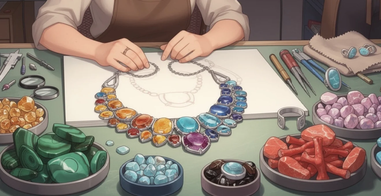
Blue remains one of the most requested colours in gemstone jewellery, but not every client wants—or can justify—the cost of large sapphires. Semi-precious stones such as lapis lazuli, larimar, and kyanite offer a nuanced spectrum of blues that can be harnessed in contemporary design. Lapis lazuli, with its deep ultramarine tone and pyrite flecks, has a historic association with royalty and sacred art. In modern jewellery, it works particularly well in bold cabochons, inlay work, and geometric pieces where its matte, velvety surface contrasts against polished metal or diamonds.
Larimar occupies a very different part of the blue spectrum. This rare pectolite from the Dominican Republic presents dreamy, cloud-like patterns in soft turquoise and white, instantly evoking tropical waters. Its relative softness makes it better suited to pendants, earrings, and statement rings with protective bezels rather than delicate stacking bands. Have you noticed how larimar’s milky patterns almost resemble aerial photographs of coastlines? Leaning into that natural imagery can inform entire capsule collections themed around travel or escapism.
Kyanite, typically a rich denim or indigo blue, brings yet another aesthetic: elongated crystals with strong pleochroism and a distinctive silky sheen. While kyanite’s perfect cleavage in one direction can challenge setters, thoughtful orientation and secure mountings yield striking results, especially in drop earrings and vertical pendant designs. When you place these three stones side by side—lapis’s opaque depth, larimar’s pastel softness, kyanite’s linear shimmer—you gain a toolkit for blue-focused semi-precious stone jewellery that can be tailored to everything from minimalist everyday pieces to theatrical statement jewels.
Organic warmth: carnelian, amber, and sunstone in contemporary settings
Warm-toned semi-precious stones bring an organic, human quality to jewellery, often reading as friendlier and more approachable than icy whites or high-saturation primary colours. Carnelian, a reddish-orange chalcedony, has been used since antiquity for seals, talismans, and signet rings. Its translucent glow, especially when backlit or set over reflective metal, imparts a soft inner warmth that flat faceting alone cannot create. Modern designers often pair carnelian with brushed gold or bronze finishes to enhance its earthy character, or combine it with black onyx for a crisp, graphic contrast.
Amber, although technically an organic fossilised resin rather than a mineral, earns its place in the semi-precious category through its evocative colour range and inclusions. From pale honey to deep cognac, amber can encase bubbles, plant fragments, or even ancient insects, turning each cabochon into a tiny time capsule. Its low density means even large beads feel light and comfortable to wear, making it ideal for substantial necklaces and layered bracelets. Because amber can scratch more easily than many stones, contemporary settings often leverage protective bead caps, textile elements, or mixed-media designs that cushion and celebrate its softness rather than hide it.
Sunstone completes this trio with its characteristic aventurescence—sparkling coppery platelets suspended within a feldspar body. When cut as cabochons or shallow domes, quality sunstone appears to glow from within, scattering warm flashes as the wearer moves. Designers looking to create “solar” themed semi-precious stone jewellery often combine sunstone with citrine, rose gold, and textured metal surfaces that echo rays of light. Think of sunstone as the gemstone equivalent of a sunrise photograph: layered, optimistic, and gently energising.
Green stone alternatives: peridot, malachite, and chrysoprase design integration
Green gemstones have long been dominated by emerald in the public imagination, but semi-precious alternatives offer a wide range of hues, textures, and price points. Peridot, a gem-quality variety of olivine, presents a vivid yellow-green colour that feels fresh and contemporary, particularly in minimalist settings. With a Mohs hardness of 6.5–7, it is suitable for regular wear provided it is not exposed to severe abrasion. Designers often use peridot as a bridge between cool and warm palettes, pairing it with amethyst for a bold complementary scheme or with citrine and garnet for autumn-inspired gradations.
Malachite introduces an entirely different aesthetic: rich, opaque green with distinctive banded patterns that can resemble topographical maps or tree rings. Because of its relative softness and sensitivity to acids, malachite benefits from protective bezels, smooth cabochon cuts, and careful handling. However, its graphic stripes make it a powerful design element, especially in Art Deco-inspired pieces, cigar bands, and cufflinks. Have you ever used malachite as you would use printed fabric in fashion—large, uninterrupted surfaces that let the pattern speak? This approach lets the stone become the “print” of the piece, with metal acting as a tailored frame.
Chrysoprase, a bright apple-green chalcedony coloured by nickel, offers a luxurious yet relatively affordable alternative to fine jade. Its translucent glow and even colour make it ideal for both contemporary and vintage-inspired designs, particularly when cut into smooth cabochons or beads. Chrysoprase pairs beautifully with polished silver for a crisp, modern look or with warm yellow gold to echo its historical use in Victorian and Art Nouveau jewellery. Together, peridot, malachite, and chrysoprase allow you to create nuanced green-focused collections that cater to clients who love the colour but seek something different from classic emerald.
Purple and pink tones: kunzite, rhodonite, and lepidolite aesthetics
Purple and pink semi-precious stones have surged in popularity alongside broader trends toward self-care, softness, and romantic minimalism in jewellery. Kunzite, a pink to lilac variety of spodumene, is admired for its delicate pastel tones and strong pleochroism. When cut correctly and set to orient its best colour toward the viewer, kunzite can deliver impressive presence at relatively large sizes. However, its sensitivity to strong light and relative brittleness mean it is best suited to occasion pieces—cocktail rings, pendants, and earrings—rather than hard-wearing everyday bands.
Rhodonite, a manganese silicate, presents a more grounded aesthetic: dusky rose or raspberry tones often accented by black veining or matrix. This natural marbling lends itself to bohemian and artisanal styles, particularly when worked into cabochons, beads, or freeform slices. Designers who lean towards earthy, “modern folk” aesthetics often use rhodonite alongside oxidised silver, leather, and hand-textured metal to create jewellery that feels both contemporary and rooted in craft traditions.
Lepidolite, a lilac-toned mica rich in lithium, brings yet another mood to purple semi-precious stone jewellery. Its fine platelets can create a subtle, glittery sheen reminiscent of a night sky, especially when stabilised and polished into cabochons. Because natural lepidolite can be fragile, it is frequently backed or composite-set to improve durability. From a design perspective, its soft lavender tones pair well with moonstone, rose quartz, and white topaz, creating calming, meditative colour stories. For brands exploring wellness-inspired or chakra-themed collections, kunzite, rhodonite, and lepidolite offer a palette that feels gentle yet emotionally resonant.
Lapidary techniques and cut styles for semi-precious stone enhancement
How a semi-precious gemstone is cut can dramatically influence not only its appearance but also its perceived value. Lapidary techniques effectively act as the “editing suite” for nature’s raw footage, deciding which aspects of a stone—colour, clarity, pattern, or optical phenomena—take centre stage. While precious stones are often subjected to strict, value-driven cutting standards to maximise price per carat, semi-precious stones allow for greater experimentation. This flexibility opens the door to creative cuts, freeform shapes, and surface treatments that emphasise artistry over mere optimisation.
For jewellery designers, understanding the basics of cabochon cutting, faceting, and alternative finishes helps you brief lapidaries more effectively and choose stones that will perform as intended in the finished piece. Even if you are not cutting the stones yourself, having a working knowledge of angles, proportions, and polish types empowers you to evaluate quality and negotiate with suppliers. Consider lapidary technique as a collaborative language between the mine and your bench: the clearer it is, the more precisely you can translate a design concept into a finished object.
Cabochon cutting methods for opaque stones: onyx and jasper applications
Cabochon cutting—shaping a stone with a smooth, domed top and flat or slightly curved base—is the traditional choice for opaque and patterned materials such as onyx and jasper. Because these stones do not rely on internal light reflection for their appeal, facets add little value; instead, a well-proportioned dome and high-quality polish showcase colour saturation and surface pattern. Onyx, typically black or banded, gains a mirror-like elegance when polished as a cabochon, making it ideal for signet rings, cufflinks, and minimalist earrings where silhouette and contrast matter more than sparkle.
Jasper, with its extraordinary range of picture-like patterns and colours, particularly benefits from intentional cabochon orientation. A skilled cutter will “frame” the most interesting area of the rough—perhaps a landscape-like scene or striking colour transition—within the outline of the cabochon, much like cropping a photograph. For designers, this means each jasper cabochon is effectively a one-off artwork, encouraging limited-edition or bespoke approaches rather than strict standardisation. Protecting these domes with bezel settings and thoughtful ring profiles ensures they remain wearable for years, even with regular use.
Faceting translucent materials: optimal angles for topaz and garnet brilliance
When working with translucent or transparent semi-precious stones such as topaz and garnet, faceting becomes the key tool for releasing brilliance and fire. The principle is straightforward: light should enter through the crown, reflect internally off the pavilion facets, and return to the eye without “leaking” out of the bottom. To achieve this, lapidaries use critical angle calculations based on the stone’s refractive index, adjusting pavilion angles to maximise internal reflection. With topaz, for example, pavilion angles around 41–43 degrees often produce strong brightness, while garnet’s higher refractive index allows slightly steeper angles without sacrificing light return.
From a design standpoint, this technical optimisation translates into lively, eye-catching stones that hold their own even in smaller sizes—a crucial consideration for semi-precious stone jewellery at accessible price points. Have you ever compared a well-cut garnet to a poorly cut one of similar colour? The former seems to glow from within, while the latter looks flat and lifeless, despite being the same material. Specifying well-proportioned cuts, even if it means slightly lower carat weight, usually yields more impactful pieces and higher perceived value.
Tumbled and freeform finishes in bohemian jewellery designs
Not all semi-precious stones need to be precisely calibrated or symmetrically cut to shine in jewellery. Tumbled and freeform finishes have become hallmarks of bohemian and artisanal aesthetics, celebrating the irregularities that traditional high jewellery might dismiss as flaws. Tumbled stones—gently rounded and polished in rotating drums—retain much of their original shape while gaining a smooth, tactile surface. They are ideal for charm bracelets, mala-style necklaces, and clustered pendants where variety of form adds visual interest.
Freeform cuts go a step further, with lapidaries sculpting the rough to follow natural contours, fractures, or colour patches rather than imposing standard outlines. This approach works particularly well for stones like labradorite, agate slices, and raw quartz points, where asymmetry and organic edges echo the stone’s geological origins. For designers, incorporating tumbled and freeform stones can be a strategic way to create jewellery that feels authentic and approachable, appealing to clients who value individuality and a tangible connection to nature.
Calibrated cutting standards for commercial multi-stone settings
While one-of-a-kind cuts have strong appeal, there is also a practical need for calibrated stones—those cut to standardised dimensions and shapes—for commercial multi-stone settings. Channel-set garnet bands, halo rings with amethyst melee, and pavé-style citrine earrings all rely on consistent sizes to achieve clean lines and even spacing. Calibrated cutting streamlines production, reduces setting time, and facilitates efficient re-ordering when a particular design proves popular. It also allows for interchangeable colourways within the same metal framework, a cost-effective strategy for expanding a semi-precious stone jewellery collection.
However, not all calibrated stones are created equal. Maintaining adequate depth in the pavilion, even for small stones, is crucial to avoid a “windowed” appearance where light passes straight through without reflection. When reviewing parcels of calibrated stones, it pays to check a sample under magnification and different lighting conditions. Are the girdles consistent? Do the tables align in height when placed side by side? These details may seem minor, but they contribute significantly to the overall polish and professionalism of a finished multi-stone design.
Contemporary designers pioneering semi-precious stone innovation
Across the global jewellery landscape, a growing number of designers and brands are championing semi-precious stones not as secondary options, but as heroes in their own right. Some luxury houses now dedicate entire collections to unconventional materials such as chrysoprase, lapis, or rhodochrosite, using high-jewellery craftsmanship to challenge outdated notions of what constitutes “worthy” gems. Others focus on ethical sourcing and traceability, highlighting semi-precious stones from small-scale mines or community projects as part of a broader sustainability narrative. In both cases, the message is clear: colour, story, and craftsmanship can matter more than historical classifications.
Independent makers, particularly those selling online or through craft-focused marketplaces, have been instrumental in pushing semi-precious innovation. By combining raw crystals with fine metals, pairing faceted tourmaline with reclaimed diamonds, or experimenting with unusual cuts like hexagons and kites, they demonstrate the design freedom that semi-precious stones afford. Have you noticed how many emerging brands build their identity around a single stone—say, labradorite or moonstone—and explore its possibilities across dozens of silhouettes? This focused approach can be a powerful differentiator in a crowded market, allowing semi-precious stone jewellery to compete directly with more traditional fine jewellery offerings.
Setting techniques and metal pairings for maximum visual impact
The way semi-precious stones are set and the metals they are paired with can dramatically influence how they are perceived. A modestly priced gem can look opulent in the right context, while a beautiful stone can appear underwhelming if the setting works against it. Designers often treat metal as both a structural support and a frame, much like the mount around a painting. Choices such as bezel versus prong, high-polish versus matte, or yellow gold versus oxidised silver are not merely stylistic; they are strategic tools for highlighting colour, protecting softer materials, and aligning with brand aesthetics.
Because semi-precious stones span such a wide spectrum of hardness, transparency, and surface finish, there is no one-size-fits-all approach. Instead, successful semi-precious stone jewellery tends to respect the material’s limitations while exploiting its strengths—using protective mountings for softer gems, open-backed settings to enhance translucency, or contrasting metal tones to make colours pop. The following setting strategies illustrate how technical decisions can enhance both beauty and longevity.
Bezel settings for soft stones: protecting opal and moonstone integrity
Soft and brittle stones such as opal and moonstone demand extra care in design. With Mohs hardness values typically between 5 and 6.5, they are more vulnerable to scratching, chipping, and sudden temperature changes than harder gems. Bezel settings—where a continuous rim of metal encircles the stone’s girdle—offer superior protection compared to exposed prongs, acting like a shock absorber against knocks. For opals, bezels also help guard against moisture loss and edge damage, both of which can compromise the stone’s play-of-colour over time.
Far from being purely functional, modern bezel designs can be remarkably refined. Slim, knife-edge bezels around moonstone cabochons create a clean, contemporary profile that still allows ample light to enter through the dome, enhancing adularescence. Partial or scalloped bezels can be used where you want a compromise between security and visual lightness. When planning bezel-set semi-precious stone jewellery, it is wise to leave a slight tolerance in the seat to accommodate minor size variations, particularly with hand-cut cabochons, while ensuring the finished rim sits flush to avoid catching on clothing.
Prong configurations for faceted tourmaline and iolite display
Faceted semi-precious stones like tourmaline and iolite often benefit from more open settings, which allow light to enter freely and maximise brilliance. Prong settings, where individual claws grip the stone at discrete points, are ideal for this purpose. Four-prong configurations offer a classic, balanced look, while six or eight prongs can be used for larger stones or where extra security is desired. With elongated baguette or emerald-cut tourmalines, double-claw prongs at the corners not only stabilise the gem but also emphasise its geometry.
Iolite, with its strong pleochroism shifting between violet-blue and greyish tones, requires especially thoughtful orientation and prong placement. Setting the stone so its most attractive axis faces up—and avoiding prongs that obscure key facets—can mean the difference between a vibrant centrepiece and a dull-looking gem. Have you ever seen an iolite ring that looked surprisingly “flat” despite good colour in the rough? In many cases, the issue lies not with the stone but with suboptimal cutting or setting choices. Collaborating closely with your setter and providing clear instructions about table alignment and prong placement can help ensure that faceted semi-precious stones perform to their full potential.
Oxidised silver contrasts with vibrant coral and turquoise cabochons
Metal colour plays a powerful supporting role in semi-precious stone jewellery. Oxidised silver, with its darkened, charcoal-like appearance, provides a dramatic backdrop for vibrant cabochons such as red coral and turquoise. The high contrast between metal and stone enhances perceived saturation, much like a dark gallery wall makes a painting’s colours appear richer. This pairing has deep roots in traditional and ethnic jewellery from regions such as the American Southwest and the Mediterranean, yet it translates seamlessly into contemporary styles, from minimalist studs to bold statement cuffs.
Designers can control the degree of oxidation—leaving highlights on raised edges while recesses remain dark—to introduce depth and texture around the stones. For example, a heavily textured, oxidised bezel around a smooth turquoise cabochon creates a tactile interplay between rough and polished surfaces. Beyond aesthetics, oxidised finishes can also be practical, as they camouflage minor scratches that would be more apparent on high-polish silver. When combined with responsibly sourced coral alternatives or vintage-reclaimed coral, this approach allows you to create visually striking pieces that acknowledge both cultural heritage and modern ethical considerations.
Market positioning and accessibility in the fine jewellery sector
Semi-precious stones occupy a fascinating niche in today’s fine jewellery market, bridging the gap between high-end luxury and everyday wear. Their relative affordability compared to the classic precious quartet allows designers to work at larger scales, experiment with bolder colour combinations, and offer clients more generous carat weights without prohibitive prices. At the same time, advances in cutting, setting, and sourcing have elevated many semi-precious stone pieces into the realm of aspirational fine jewellery, particularly when paired with gold, platinum, or recycled precious metals.
From a branding perspective, semi-precious stone jewellery can be positioned in several ways. Some labels frame it as an entry point into fine jewellery, ideal for first-time buyers or milestone gifts that feel special yet accessible. Others emphasise rarity and narrative over traditional hierarchy, spotlighting unusual stones, limited geographic sources, or artisanal cutting as markers of exclusivity. The growing consumer interest in ethical sourcing and individuality further supports this shift, as clients increasingly value transparency, design integrity, and personal resonance over rigid notions of “preciousness.”
For designers and retailers, the key to successful market positioning lies in clear communication. Explaining why a particular labradorite was chosen for its exceptional flash, or how a suite of hand-cut chrysoprase cabochons showcases natural variation, helps clients appreciate the artistry and geology behind each piece. Providing care guidance tailored to softer or more porous stones reinforces trust and reduces post-purchase issues. Ultimately, semi-precious stones bring not only colour and creativity to jewellery design but also flexibility in price, story, and style—qualities that align perfectly with the evolving values of modern jewellery lovers.