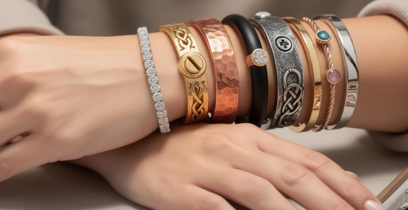
The art of layering cuffs and bangles has evolved from a simple styling choice into a sophisticated form of personal expression that speaks volumes about your aesthetic sensibilities. Today’s jewellery enthusiasts are moving beyond single-piece statements to create complex, multi-dimensional arrangements that transform the wrist into a curated gallery of metalwork, texture, and design. This approach to bracelet styling requires a deep understanding of proportion, material harmony, and visual balance to achieve truly striking results.
Creating a bold wrist style through strategic layering demands both technical knowledge and artistic intuition. The most successful arrangements seamlessly blend different materials, widths, and finishes whilst maintaining cohesion and wearability. Whether you’re incorporating vintage heirloom pieces or contemporary designer creations, the principles of effective layering remain consistent: balance, contrast, and intentionality guide every decision in building your perfect stack.
Understanding bracelet proportions and wrist anatomy for optimal layering
The foundation of successful bracelet layering begins with understanding the unique anatomy of your wrist and how different proportions interact with your natural bone structure. The wrist contains several key anatomical landmarks that influence how bracelets sit and move, including the radial and ulnar styloid processes, which create the bony prominences on either side of your wrist. These points determine the optimal placement zones for different bracelet styles, with cuffs typically sitting best just above the wrist bone and bangles finding their ideal position slightly higher on the forearm.
Wrist circumference plays a crucial role in determining the appropriate number and width of pieces in your layered arrangement. Smaller wrists, typically measuring 6 inches or less in circumference, benefit from no more than three to four pieces to avoid overwhelming the delicate bone structure. Medium wrists, ranging from 6.5 to 7 inches, can accommodate five to six pieces when properly proportioned, whilst larger wrists of 7.5 inches and above can support more substantial arrangements of seven or more bracelets without appearing cluttered.
The spacing between individual pieces creates visual rhythm and prevents the tangling that often plagues poorly planned stacks. Professional stylists recommend maintaining approximately 5-10mm of space between rigid pieces like bangles, allowing them to move independently whilst creating subtle metallic percussion during natural hand movements. This spacing also accommodates the natural swelling that occurs throughout the day, ensuring comfort during extended wear periods.
Consider the natural taper of your forearm when positioning pieces within your stack. Cuffs and wider bangles should sit closest to the wrist bone where the circumference is smallest, whilst thinner pieces can be positioned higher where the arm naturally widens. This graduated positioning creates a flattering silhouette that enhances rather than disrupts your arm’s natural proportions, making even substantial arrangements appear effortless and intentional.
Essential metal mixing techniques: rose gold, sterling silver, and yellow gold combinations
The strategic combination of different metals forms the backbone of sophisticated bracelet layering, requiring an understanding of both colour theory and metallurgical properties. Modern jewellery design has moved far beyond the traditional “no mixing” rule, embracing the visual richness that comes from thoughtfully combining rose gold, sterling silver, and yellow gold within a single arrangement. The key lies in establishing a dominant metal that comprises approximately 60-70% of your stack, with secondary and accent metals filling the remaining proportion.
When working with multiple metal types, consider their inherent hardness and wear characteristics. Sterling silver, being softer than gold alloys, requires careful positioning to prevent scratching from harder metals. Place silver pieces between gold bangles rather than allowing direct contact, or choose pieces with protective finishes that can withstand the friction of daily wear. This practical consideration ensures your investment pieces maintain their lustrous appearance over time.
Temperature theory: warm vs cool metal undertones in layered arrangements
Understanding metal temperature theory revolutionises your approach to creating harmonious mixed-metal arrangements. Warm metals like yellow gold, rose gold, and copper create inviting, sun-kissed tones that complement warm skin undertones beautifully. These metals work particularly well when combined with rich gemstones like garnets, citrine, or amber, creating cohesive colour stories that
feel almost sun-warmed on the skin. Cool metals such as sterling silver, white gold, and rhodium-plated pieces bring a sharper, moonlit quality that pairs well with cooler complexions and crisp wardrobe palettes. When you layer cuffs and bangles in mixed temperatures, aim to let one temperature family lead visually, then introduce the other as an accent through one or two strategic pieces. For example, a primarily yellow gold stack punctuated with a single, slender sterling silver bangle reads intentional rather than accidental. Think of metal temperature the way you think of lighting in a room: a consistent base with a few contrasting highlights creates atmosphere without visual noise.
To make temperature theory work for your bold wrist style, start by identifying the dominant undertone of both your skin and your existing jewellery collection. If you naturally gravitate to warm metals, you can still incorporate cool silver or rhodium by placing them at transition points—next to a watch bezel, for instance, or between two rose gold cuffs. Conversely, cool-metal lovers can soften the look with a single rose gold bangle that acts like a subtle filter over the whole arrangement. As you refine your mixed-metal stacks, notice how different undertones interact with your wardrobe: earthy linens and camel coats amplify warm metals, while black tailoring and white shirts sharpen cooler tones.
Cartier love bracelet as anchor piece: building around statement cuffs
Few pieces function as reliably as the Cartier Love Bracelet when it comes to anchoring a bold cuff and bangle stack. Its rigid oval form, consistent width, and unmistakable screw motif create a visual baseline that other bracelets can orbit around. Because the Love Bracelet sits relatively low on the wrist and is designed for continuous wear, it naturally becomes the structural core of your layered wrist style. Treat it as the architectural column against which you lean lighter bangles, textured cuffs, and occasional gemstone pieces.
When building around a Love Bracelet, pay close attention to width gradation and metal tone. A classic yellow gold Love pairs beautifully with slimmer bangles in matching alloy placed closer to the hand, followed by slightly wider cuffs higher on the forearm to create a gentle taper. If you own multiple versions—say, a yellow gold Love and a pavé diamond Love—allow only one to act as the true statement at a time, keeping the other surrounded by simpler, satin-finished companions. This prevents the wrist from tipping into visual overcrowding and maintains the refined, engineered elegance that makes the piece iconic.
For those layering a Love Bracelet with mixed metals, consider using it as the dominant temperature reference. A rose gold Love, for example, can bridge warm and cool by sitting between sterling silver bangles and yellow gold cuffs, acting as the tonal translator across the stack. Because the bracelet cannot be quickly removed, build flexibility around it with hinged bangles and open cuffs that you can rotate with season, dress code, or mood. That way, your permanent anchor remains constant while your bold wrist style evolves effortlessly.
Oxidised silver patina effects with polished brass accents
Oxidised silver introduces depth and character to a cuff and bangle stack, functioning almost like shadow in a drawing—it defines form and makes polished areas appear even brighter. The darkened patina, often ranging from charcoal grey to near-black, brings an artisanal, lived-in quality to layered arrangements. When paired with polished brass accents, the contrast between matte darkness and liquid brightness becomes especially striking, ideal for those who want a bold wrist style that feels both modern and slightly industrial. The key is to let the oxidised pieces carry the visual weight, while brass provides sharp points of reflected light.
Because oxidised silver can highlight surface texture so effectively, it works best in designs with deliberate patterning: hammered finishes, etched motifs, or cable twists. Position these pieces toward the centre of your stack, then flank them with narrower, mirror-polished brass bangles that catch the eye as the wrist moves. This creates a push–pull dynamic, where your gaze alternates between light and shadow, smooth and rough. To prevent premature wear of the patina, avoid stacking oxidised silver directly against very hard or sharply edged cuffs that could scrape the surface; instead, buffer with a softer, smoother bracelet in between.
From a colour-theory perspective, oxidised silver and polished brass replicate the balance of charcoal and gold in contemporary interiors—a pairing favoured in high-end design for its sophistication. You can echo this dynamic in your wardrobe by pairing such stacks with black denim, leather jackets, or tailored blazers in deep navy and graphite. If you want to soften the effect for daytime, introduce a single sterling silver bangle with a soft satin finish between the oxidised and brass elements. This acts like a gradient, easing the transition between darkness and brightness and making the overall stack more wearable across different settings.
Two-tone finish integration: bi-metal bangles and gradient effects
Two-tone bangles and cuffs are powerful tools when you are refining mixed-metal bracelet layering, because they act as built-in bridges between colour families. A bi-metal piece—perhaps yellow gold on one half and white gold or sterling silver on the other—visually justifies the presence of multiple metals across your wrist. Rather than appearing as separate, competing elements, yellow, rose, and white tones begin to read as a single, orchestrated composition. Think of these pieces as gradient filters in photography: they transition the eye smoothly from one tone to another without a hard break.
To make the most of bi-metal bangles, position them at transition points within your stack. If your wrist style moves from a predominantly yellow gold Cartier Love Bracelet near the hand to cooler sterling silver cuffs higher up, place a two-tone bangle between these sections. Align the yellow gold side toward the Love and the white or silver side toward the cooler pieces, effectively “handing off” the colour story. This simple orientation trick creates continuity and makes even complex metal mixes feel intentional.
Gradient effects can also be created through finish rather than alloy alone. For example, you might move from high-polish yellow gold near the wrist bone to brushed gold, then to matte white gold or silver as you travel up the forearm. Interspersing bi-metal bangles along this path reinforces the sense of flow. If you are new to mixed metals but want a bold wrist style, investing in one or two well-designed two-tone cuffs is often more effective than buying multiple single-metal pieces. They deliver built-in versatility and allow you to pivot between warm and cool jewellery wardrobes without starting from scratch.
Texture contrast methodology: hammered, twisted, and smooth surface combinations
Texture is one of the most underutilised levers in creating a bold wrist style with cuffs and bangles. Where metal mixing speaks to colour harmony, textural contrast defines how light interacts with your stack and how tactile the arrangement feels in motion. Hammered, twisted, brushed, and mirror-polished surfaces all catch and reflect light differently, much like different fabrics—think velvet versus silk versus linen—read distinctively even in the same colour. By deliberately alternating these textures, you introduce rhythm and depth to your bracelet layering without necessarily increasing the total number of pieces.
A practical methodology for texture contrast starts with designating one dominant surface, such as smooth high-polish metal, which will account for roughly half of your stack. The remaining pieces then serve as textural counterpoints: hammered cuffs that scatter light, twisted wire bangles that create fine linear shadows, or engraved bands that reveal detail on closer inspection. This balance keeps the look cohesive from a distance while rewarding a second glance with intricate surface play. Ask yourself: from arm’s length, does the stack read as a single, unified shape, and up close, does it offer enough variation to stay interesting?
Hammered copper cuffs with mirror-polished sterling silver bangles
Hammered copper cuffs are a natural choice when you want warmth, artisanal character, and visible texture all in one piece. Their dappled surfaces diffuse highlights, creating a softer glow that contrasts beautifully with the sharp, almost liquid reflections of mirror-polished sterling silver bangles. When you layer these together, you are effectively pairing sunrise (copper) with moonlight (silver), giving your bold wrist style a dynamic, day–night quality. The trick is to let each finish do what it does best: copper as the textural centrepiece, silver as the sleek frame.
For a balanced arrangement, position one or two hammered copper cuffs closest to the wrist bone, where they anchor the stack visually. Above them, add two to three slim, mirror-polished sterling bangles that move more freely toward the mid-forearm. The polished surfaces will slide and catch light with every gesture, while the hammered cuffs remain stable, preventing the stack from feeling too restless. Because copper can patinate over time, gradually deepening in tone, this combination also evolves with wear, giving your bracelet layering an organic, lived-in quality.
Care considerations matter here: copper is more reactive than sterling silver and can transfer colour to skin for some wearers. If you love the look but are concerned about sensitivity, you can choose copper pieces with clear protective coatings or opt for rose gold–plated hammered cuffs that mimic the warmth of copper with improved stability. Whichever route you choose, the juxtaposition of hammered metal and mirror polish remains one of the most effective ways to build depth into a mixed cuff and bangle stack.
Cable-twisted wire techniques paired with flat band geometry
Cable-twisted wire bracelets introduce linear movement and a subtle sense of tension to your wrist stack, as if the metal itself has been wound with energy. Their ridged profiles create fine highlights and shadows that shift as you turn your arm, which makes them ideal companions for flat, unadorned bands. This pairing is analogous to mixing ribbed knitwear with a smooth leather jacket in fashion styling: the interplay of raised and flat surfaces creates sophistication without relying on colour alone.
When layering cable twists with flat bands, use the cable pieces as textural dividers rather than crowding them side by side. A simple strategy is to alternate: flat band, cable twist, flat band, particularly if you are working with similar metal tones like all-yellow gold or all-sterling silver. This sequencing ensures that each bracelet has room to breathe and that the wrist does not read as a single, bulky column of metal. For a more architectural look, place one substantial cable cuff at the centre of the stack, framed by two or three ultra-minimalist flat bangles that echo its metal tone but not its texture.
Cable-twisted designs often come with end caps or decorative terminals, sometimes set with small gemstones or enamel. Be mindful of how these details interact with neighbouring pieces; raised end caps can snag on delicate chains or scratch softer alloys. To avoid unnecessary wear, place cable bracelets so their decorative ends don’t sit directly against pavé-set tennis bracelets or high-polish heirloom cuffs. With thoughtful spacing and alignment, cable and flat-band geometry can give your bold wrist style a sense of engineered precision.
Engraved celtic knotwork against contemporary minimalist bands
Engraved Celtic knotwork cuffs and bangles bring narrative and heritage into your bracelet layering, their interlacing lines symbolising continuity and connection. On their own, such pieces can feel ornate, especially in heavier gauges, but when offset with contemporary minimalist bands, they gain new relevance. The clean lines of plain cuffs act like white space around a detailed illustration, allowing the knotwork to be appreciated without overwhelming the wrist. This is an ideal combination if you want your bold wrist style to carry cultural or symbolic meaning while still feeling modern.
To integrate engraved knotwork successfully, treat it as the focal texture in your stack. Choose one substantial Celtic cuff in sterling silver or yellow gold and place it at a central position along the wrist, then support it with two to four minimalist bands that share its metal tone but lack surface decoration. The contrast between intricate engraving and smooth planes draws the eye to the narrative piece first, then allows it to rest on the calmer surroundings. If you prefer mixed metals, you might pair a silver Celtic cuff with slim rose gold bands, creating a subtle colour frame around the engraved story.
Because engraved surfaces can accumulate dirt more readily than smooth ones, build care into your styling routine. Avoid stacking heavily engraved cuffs directly beside textured or sandblasted pieces that might trap debris in the grooves between them. Instead, use at least one plain band as a buffer, which not only highlights the engraving but also simplifies cleaning. Over time, a slight patina developing in the recessed lines can enhance contrast, much like ink in an etching, further deepening the visual interest of your layered wrist.
Matte black ceramic integration with high-gloss metal finishes
Matte black ceramic cuffs and bangles introduce a contemporary, almost architectural element to your bracelet layering. Their soft, light-absorbing surfaces act as negative space within a stack, allowing adjacent high-gloss metals to shine more intensely by comparison. When you position a ceramic piece alongside polished yellow gold or sterling silver, the effect is similar to hanging a bright artwork on a deep charcoal wall—the contrast sharpens edges and heightens drama. For anyone seeking a bold wrist style with a distinctly modern edge, this combination is particularly compelling.
Ceramic has practical advantages as well: it is lightweight, highly scratch-resistant, and hypoallergenic, making it suitable for daily wear even in larger cuff forms. To integrate it seamlessly, place a matte black ceramic bangle either at the extreme end of your stack closest to the hand, where it reads like a visual “full stop,” or in the centre as a grounding element. Flank it with two or more high-polish metal bangles that pick up ambient light and move freely. The stillness of the ceramic against the fluidity of metal creates a sophisticated tension.
Because ceramic cannot be resized once produced, choosing the correct fit is critical. A piece that is too loose may rotate awkwardly and disrupt your carefully considered layering sequence. Aim for a comfort fit that allows minimal vertical movement on the wrist but does not pinch at the sides. When combining ceramic with softer metals like high-karat gold, be aware that the harder ceramic surface can mark neighbouring pieces over time; using slightly thicker metal bangles or placing a stainless steel bracelet as a buffer can reduce contact wear while preserving the overall mixed-material aesthetic.
Width gradation strategies: tapering from statement cuffs to delicate bangles
Width gradation is one of the most effective structural tools for keeping a bold wrist style visually balanced and comfortable. Instead of stacking cuffs and bangles randomly, you can create a deliberate taper—from your widest, most substantial cuff near the narrowest part of the wrist to finer bangles higher on the forearm. This mirrors the natural anatomy of the arm, which widens as it moves toward the elbow, and prevents the stack from looking boxy or abruptly truncated. Think of it as building a skyline: a few tall “buildings” at the centre, surrounded by gradually lower structures that lead the eye outward.
A simple method for implementing width gradation is to arrange your bracelets on a flat surface first, from widest to narrowest, then transfer them onto your wrist in that order. Place the boldest cuff or Cartier Love Bracelet at the base, followed by medium-width bangles, and finish with ultra-fine wires or chains toward the top. If you prefer the statement piece higher on the forearm, you can reverse the gradient, but maintain a steady progression rather than jumping back and forth between extremes. This continuity avoids visual “speed bumps” that break the flow of your layering.
Your wrist circumference will influence how dramatic the taper can be. On smaller wrists, even a two-step gradient—one wide cuff plus two or three slim bangles—may be sufficient to create the illusion of layering without overcrowding. Larger wrists can support a more extended gradation, moving through three or four width categories. Pay attention to functional comfort as well: wider pieces should generally sit where the wrist bends least, while narrower, more flexible bracelets can occupy the higher, more mobile part of the forearm. As you experiment, ask yourself whether the stack looks intentional from multiple angles—front, side, and in motion—since a well-graded arrangement should remain coherent even as you gesture.
Gemstone and crystal placement hierarchy in multi-bracelet compositions
Introducing gemstones and crystals into a cuff and bangle stack adds colour, luminosity, and a sense of luxury, but it also raises the stakes for thoughtful placement. Hardness scales, setting styles, and optical effects all come into play when determining where in the hierarchy each piece should sit. In general, the more prominent and light-catching a stone arrangement, the closer it should be to the visual centre of your stack, with supporting pieces radiating outwards. This ensures that your bold wrist style has a clear focal point rather than competing points of sparkle scattered at random.
From a practical standpoint, gemstone bracelets benefit from protection against abrasion and impact, particularly softer materials like turquoise or mother-of-pearl. Position these pieces away from sharp-edged cuffs and avoid sandwiching them directly between very rigid bangles that could pinch them during movement. Instead, use smoother metal bands as “buffers” on either side of a gem-set bracelet, creating a safety zone that also frames the stone visually. Harder stones such as diamonds, sapphires, and Swarovski crystals are more forgiving but still deserve strategic placement so their optical performance is maximised.
Swarovski crystal accents as focal points in layered arrangements
Swarovski crystals are engineered for high refraction and precise faceting, which gives them an almost electric sparkle under both natural and artificial light. In a layered cuff and bangle stack, even a small row of these crystals can easily become the main focal point. To harness this effect rather than fight it, designate your Swarovski piece as the hero bracelet around which other elements are composed. Place it in a prime visual location—typically at the top of the wrist where it will be most visible in conversation—and support it with less reflective metals nearby.
Because Swarovski crystals are often set in rhodium-plated or sterling silver bases, they naturally skew cool in tone. When pairing them with warm metals, use a bridging element such as a bi-metal bangle or a brushed white gold cuff to prevent a jarring jump in temperature. Keep neighbouring textures relatively restrained: smooth polishing or gentle brushing rather than heavy hammering ensures that the main sparkle remains with the crystal rather than being diluted by competing light effects. If you wear a watch, consider aligning the crystal bracelet just above it, so together they form a luminous anchor for the rest of your stack.
In terms of durability, Swarovski pieces sit somewhere between fine and fashion jewellery; they are designed for regular wear but still appreciate thoughtful handling. Avoid positioning them directly against very hard materials like ceramic or tungsten, which could chip the crystal edges over time. After a day of wear in a mixed stack, a quick wipe with a soft cloth helps maintain their clarity and brilliance, ensuring they continue to earn their place as the visual centre of your bracelet layering.
Natural stone positioning: turquoise, onyx, and mother-of-pearl distribution
Natural stones such as turquoise, onyx, and mother-of-pearl bring organic colour stories and subtle variations that no lab-created material can fully replicate. Each has its own optical character: turquoise provides matte, saturated colour; onyx offers deep, light-absorbing black; mother-of-pearl gives an iridescent, shifting sheen. When integrating these into a bold wrist style, think of them as colour blocks or texture panels that punctuate your metal framework. Rather than scattering them evenly, consider assigning each stone type a specific position or role within the stack.
Turquoise, with its strong colour presence, works well as a mid-stack accent, especially in summer or resort-inspired looks. Place a turquoise-set cuff between neutral metal bangles so that its blue-green tone stands out without overwhelming the entire composition. Onyx, by contrast, is excellent for grounding a very reflective or high-sparkle arrangement; a slim onyx bracelet placed nearest the hand can act like a visual underline that anchors the rest of the stack. Mother-of-pearl, with its soft, pearlescent glow, often shines brightest when closer to the light source, so positioning it higher on the forearm can allow its iridescence to play more freely.
From a care perspective, these stones are softer than diamonds or sapphires and should be treated accordingly. Avoid stacking turquoise or mother-of-pearl directly between heavy metal cuffs that could compress them, especially if you frequently rest your wrists on hard surfaces while typing or driving. Onyx is somewhat more resilient but still benefits from neighbouring bracelets with smooth edges and minimal protrusions. By designing a placement hierarchy that respects both the aesthetic and physical properties of these natural stones, you can enjoy their character for many seasons without sacrificing the integrity of your layered look.
Diamond tennis bracelet integration with casual stacking pieces
A diamond tennis bracelet is one of the most versatile and coveted additions to any wrist wardrobe, capable of crossing from black-tie events to off-duty denim with ease. Its continuous line of stones delivers a refined, uninterrupted sparkle that instantly elevates a cuff and bangle stack. To integrate such a piece into more casual bracelet layering, treat it less like a standalone evening jewel and more like a luminous thread woven through your everyday metalwork. The objective is to let it glimmer subtly among more relaxed textures rather than dominate the entire composition.
Positionally, a tennis bracelet sits best either directly adjacent to a watch—creating a polished core around which more rustic bangles can orbit—or slightly higher on the wrist as a shimmering bridge between structured cuffs and flexible chains. Because diamonds rank highest on the Mohs hardness scale, they will not be scratched by most metals, but their settings can be vulnerable to repeated impact. To protect prongs and channels, avoid placing the bracelet between very rigid, heavy cuffs that might squeeze it during abrupt wrist movements. Instead, cushion it with one or two lighter bangles or soft leather wraps.
Stylistically, pairing a tennis bracelet with casual pieces like matte bangles, braided cords, or oxidised silver cuffs creates an appealing high–low mix. This combination reflects current trends in luxury styling, where fine jewellery is no longer reserved strictly for formal occasions. If your tennis bracelet is in white gold or platinum, introduce a warm-toned cuff or bangle elsewhere in the stack to prevent the overall effect from skewing too frosty for daytime. Conversely, a yellow gold tennis bracelet can act as the warm heart of an otherwise cool, silver-heavy arrangement, ensuring your bold wrist style feels balanced and wearable from morning through late evening.
Clasp configuration and security systems for heavy layered arrangements
As your cuff and bangle stacks become more ambitious—particularly when they incorporate heavier metals or high-value pieces—clasp configuration and security move from afterthought to essential design consideration. A bold wrist style loses its appeal if you are constantly worried about losing a bracelet or if clasps dig uncomfortably into the skin. The goal is to engineer a system where each fastening mechanism supports the others, distributing weight and minimising points of failure. This often means mixing closure types strategically rather than relying on a single style across the entire stack.
Start by identifying one or two bracelets with the most secure closures—typically box clasps with safety eights, double push-button deployants, or screw-on mechanisms like the Cartier Love. These should serve as anchors, positioned closest to the wrist bone where movement is most controlled. Around them, you can layer pieces with simpler lobster clasps, spring rings, or hook-and-eye closures, which are easier to put on and remove but benefit from the stabilising presence of the more secure anchors. Open cuffs, which rely on tension rather than clasps, are best placed where accidental snagging is least likely, usually higher on the forearm.
For very heavy or gemstone-rich stacks, consider the direction in which each clasp closes and opens. Stagger them so that not all release points align on the same side of the wrist; this reduces the risk of multiple bracelets coming undone simultaneously if one area is bumped or caught. You can also use a subtle hierarchy of closure reliability: the most valuable or sentimental pieces should have the most robust clasps and be positioned inboard, closer to the hand, while lighter, more replaceable bangles sit outboard. If you regularly wear watches, let the watch strap or bracelet act as part of the security network, bracketing more delicate pieces so they cannot slide past it.
Comfort is just as important as safety in clasp configuration. Multiple fastening mechanisms clustered in one spot can create pressure points, especially if you spend time typing or resting your wrists on a desk. To mitigate this, rotate clasp positions around the circumference of the wrist and vary their vertical placement within the stack. If you find that a particular closure repeatedly flips to the underside and digs into the skin, experiment with repositioning that bracelet higher or lower in the sequence or pairing it with a narrow, smooth bangle that acts as a buffer. With thoughtful planning, your clasp systems can become almost invisible in day-to-day wear, allowing the visual drama of your cuffs and bangles to take centre stage while the engineering quietly does its job in the background.